New York City Type
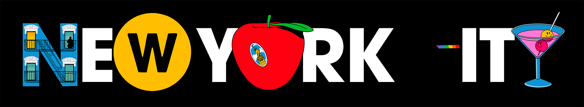
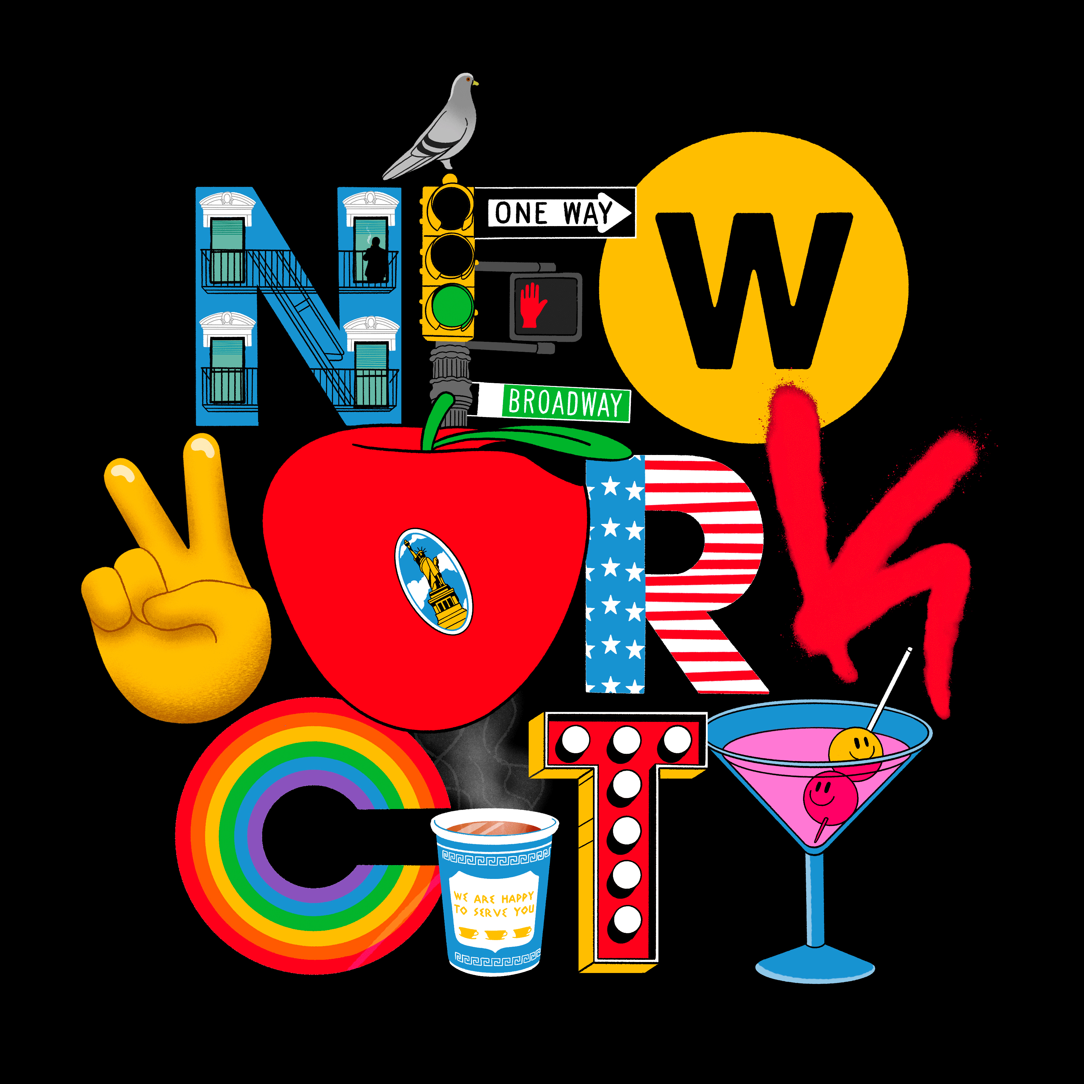
I set myself a self initiated challenge, to create a type piece that only used illustration in the place of typography. Just for a bit of fun! Here’s what I came up with. It’s an homage to New York City, using some of my favourite things about the city. I had so much fun illustrating, and animating this. See some of the images below to see how I got to this very busy final piece.
I set myself a self initiated challenge, to create a type piece that only used illustration in the place of typography. Just for a bit of fun! Here’s what I came up with. It’s an homage to New York City, using some of my favourite things about the city. I had so much fun illustrating, and animating this. See some of the images below to see how I got to this very busy final piece.
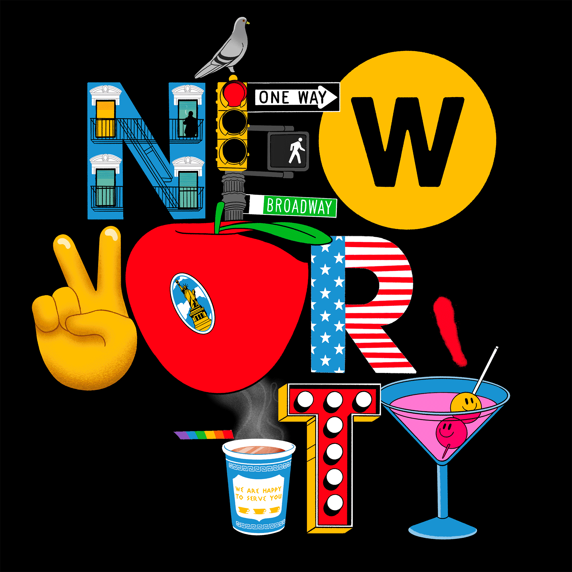
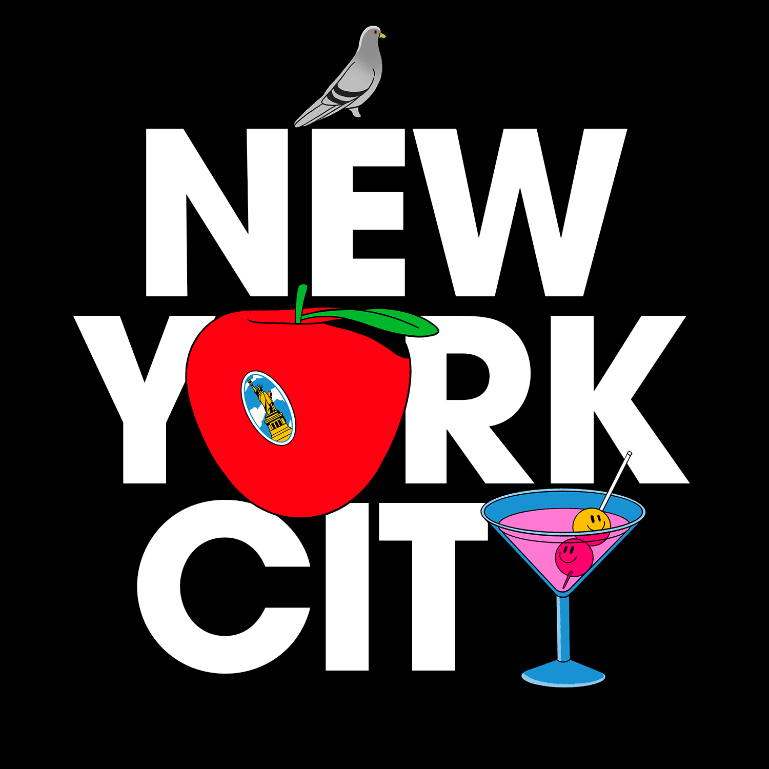
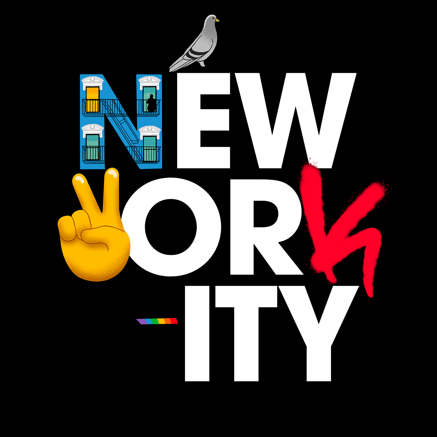
I love the idea that the illustrated type could slot in amongst an existing typeface. So I started by laying out some type, and slowly adding illustrations to the design to see if they fitted in. Some of these simple compositions with minimal type layout and just a couple of illustrations work so nicely.
Each element was individually drawn to give it a real hand drawn cell animation feel. Below are 7 of the 17 illustrations that we drawn for the spinning apple illustration.

Below is the finished composition as a static illustration. It was important to get to this point first before I started animating it, to see if it all worked together. Once I was happy with all of the individual elements I started animating it.
© 2017 Toby Triumph